Color and texture pairings to define functional zones
Defining functional zones in a living space often depends on more than furniture placement: color and texture provide visual cues that clarify use, improve circulation, and influence comfort. This article outlines practical pairings and design considerations—from seating and lighting to acoustics, storage, and sustainable materials—to help create cohesive, purposeful areas.

Designing a cohesive living area benefits from deliberate use of color and textures to signal different functions without building walls. Thoughtful pairings guide movement, support ergonomics, and influence perception of proportion while allowing flexible layouts. Below are focused strategies that link seating, lighting, zoning, acoustics, storage, materials, and more into an integrated plan for comfortable, usable spaces.
How can seating and furniture express zones?
Seating choices and furniture arrangement are the most direct indicators of a zone. Use upholstery textures and colors to distinguish a conversation nook from a media area: tactile boucle or velvet in warm tones can invite lounging, while smoother, darker fabrics on streamlined pieces can suggest focus. Arrange furniture to support circulation and sightlines, keeping proportion in mind so pathways remain clear. Consider ergonomics for each use—supportive cushions for reading chairs, lower, deeper sofas for lounging—and pair those with area rugs or subtle texture changes to anchor each zone.
What color and textures help with zoning?
Color contrast and layered textures create visual boundaries without physical dividers. Apply a slightly different wall color or a textured wallpaper on a single wall to define a workspace or reading corner. Introduce textured elements—woven baskets, ribbed throws, or matte plaster—to signal a domestic storage or play area. Balance saturated accents with neutral backgrounds to avoid visual clutter; small, deliberate changes in hue and finish are usually more effective than dramatic shifts. Materials should be chosen for durability in high-use zones and tactility in comfort-focused areas.
How does lighting affect circulation and layout?
Lighting informs how a space is used and perceived. Use layered lighting—ambient, task, and accent—to emphasize function: table lamps and adjustable floor lights for reading nooks, directional track lighting for art or shelving, and softer ambient fixtures for conversation zones. Light color temperature can also distinguish areas; cooler task lighting enhances focus, while warmer tones support relaxation. Position fixtures to maintain clear circulation, avoid glare along pathways, and highlight material textures that reinforce the zone’s purpose.
How can acoustics and materials improve comfort?
Acoustics are often overlooked when zoning by color and texture, yet they materially affect usability. Soft textiles—heavy drapes, upholstered panels, rugs—absorb sound and make conversation zones more comfortable. Hard surfaces with reflective finishes may suit dining or activity areas where liveliness is expected, but consider acoustic panels or layered textiles near media setups. Choose materials with both aesthetic and acoustic properties in mind: cork, wool, and recycled textile panels can provide sound control while supporting sustainability goals.
Where do storage, proportion, and layout intersect?
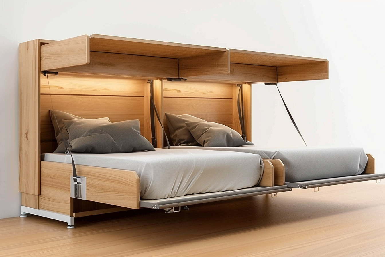
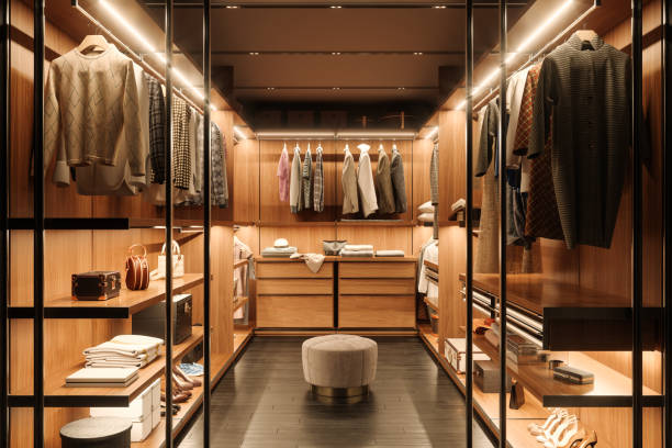
Storage solutions help zones remain distinct and functional. Built-in shelving, low credenzas, or open cubbies can act as partial dividers while maintaining sightlines and circulation. Pay attention to proportion: tall storage units will visually close off a zone, while low pieces preserve openness. Choose textures and colors for storage that either blend with the background to stay unobtrusive, or contrast slightly to signal a separate function. Thoughtful ergonomics—reachable shelf heights, pull-out drawers—keeps the storage usable and supports the zone’s intended activities.
How do sustainability and automation influence material choices?
Sustainable materials and automation can be integrated without sacrificing texture or color intent. Natural fibers, low-VOC paints, reclaimed wood, and durable recycled upholstery offer tactile variety and age gracefully. Automation—motorized blinds, scene-controlled lighting, smart thermostats—can adapt zones for multiple uses while preserving the visual cues established by color and texture. When choosing finishes, consider lifecycle impacts and maintenance: lighter textured fabrics may hide wear, while modular furniture allows reconfiguration as functions evolve.
Conclusion Color and texture pairings are powerful tools for defining functional zones in living areas. Paired with deliberate seating choices, layered lighting, acoustic treatments, and thoughtful storage, they guide circulation, respect proportion and ergonomics, and support sustainability goals. By prioritizing durable materials and flexible systems, designers and homeowners can create versatile spaces that read clearly and adapt to changing needs.


