Color selection and its effects on relaxation and sleep patterns
Choosing the right colors for a bedroom can shape how easily you relax and how well you sleep. Color interacts with light, textiles, and layout to influence circadian cues and perceived comfort. This article outlines practical color choices and how they work with other design elements to support rest.

The colors you choose for a bedroom affect more than aesthetics: they interact with lighting, textiles, and room organization to shape how easily you fall asleep and how restful that sleep feels. Cooler, muted hues often reduce visual stimulation and can support the body’s transition toward rest, while high-contrast or very bright colors can be activating. Consider how color works with natural light, artificial lighting, and placement of furniture to create a coherent environment that supports sleep patterns without overpowering other design needs.
This article is for informational purposes only and should not be considered medical advice. Please consult a qualified healthcare professional for personalized guidance and treatment.
How does color influence sleep and circadian rhythms?
Color affects perception of time of day and mood, which in turn can interact with circadian responses. Warm tones near dusk can feel cozy, but overly saturated warm reds or oranges may increase alertness in some people. Cooler blues and soft greens are commonly associated with calm and can help the mind downshift, although intense blue light from screens impacts circadian signaling differently than painted surfaces. Use color to reduce visual noise close to bedtime, and rely on lighting choices rather than wall color to mimic sunrise or sunset cues that align with your circadian rhythm.
How can layout and ergonomics promote relaxation?
Layout and ergonomics determine sight lines, accessibility, and the physical ease with which you use the space. Position the bed so windows and lighting are managed without awkward angles; allow space for natural movement and easy access to storage to avoid clutter. Ergonomic choices—mattress height, bedside reach distances, and clear pathways—reduce nighttime disturbances and stress. Coordinating color with layout can support relaxation by defining restful zones (a muted headboard wall, for instance) and keeping activity areas visually distinct.
How should lighting support sleep patterns?
Lighting works hand-in-hand with color to shape perceived ambiance. Soft, warm artificial lighting in the evening reduces blue-rich light exposure that can delay melatonin release, while brighter, cooler lighting during the day helps maintain alertness. Use layered lighting—overhead, task, and accent—to control contrast and avoid harsh reflections off saturated paint or glossy surfaces. Dimmable fixtures and bulbs with adjustable color temperature are practical tools to adapt the room’s light to the time of day and your circadian needs.
How do acoustics and ventilation affect rest?
Color won’t mask sound or stale air, so acoustics and ventilation are essential complements to a calming palette. Soft textiles and wall coverings can absorb noise and reduce echoes, enhancing the calming effect of muted colors. Proper ventilation maintains air quality and thermal comfort, both critical to uninterrupted sleep. Combining sound-absorbing rugs and curtains with colors that visually suggest calm—such as soft greys or muted greens—helps create an environment that supports both the hearing and the physiological aspects of rest.
How do textiles, storage, and organization contribute to comfort?
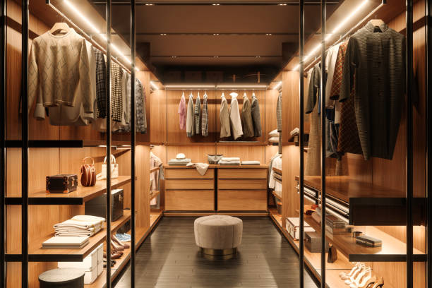
Textiles like bedding, curtains, and rugs add tactile comfort and modulate color intensity through texture and pattern. Natural fibers often perform better for breathability and moisture regulation. Effective storage and organization keep clutter out of sight, which allows chosen colors and lighting to work without competing visual distractions. Select storage finishes and textiles that harmonize with wall color to maintain a cohesive, calming visual field that reduces cognitive load when winding down.
How does sustainability intersect with bedroom design?
Sustainable choices affect both material health and the sensory quality of a room. Low-VOC paints, sustainably sourced textiles, and long-lasting finishes reduce off-gassing and support indoor air quality—factors that influence sleep quality. Neutral and adaptable color palettes can extend the useful life of furnishings by making future updates easier, while recycled or responsibly produced materials can align with an overall design that values longevity over frequent change.
Incorporating color thoughtfully means balancing personal preference with practical elements: layout, lighting, textiles, acoustics, ventilation, storage, ergonomics, and organization. Rather than relying solely on color to induce sleep, use it as one part of a layered approach that includes appropriate lighting schedules and clutter-free design. A coordinated, calming palette paired with good sleep-supporting practices creates a bedroom environment that supports more consistent and restorative sleep patterns.


